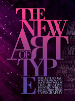
I recently discovered the work of spanish graphic designer Emiliano Lionel Suarez, whose use of typography has really inspired me on this new project. I like the use of the serif fonts as they are not as bold as something like helvetica which is really strong, serifs are softer and look a little more elegant, something i have taken on board for my logo etc, i also like the different sizes and overlapping of the text, as it brings in another dimension
Monday, 18 April 2011
Thursday, 14 April 2011
We recently got the task of creating a presentation as part of a debate between two teams, we got the question of is The Turner Prize a Valid Institution? I didn’t think it would be too hard at first, however i got the task of trying to validate the Prize, and trying to find vaild points is very difficult, i dont want to give too much away on here as other people will be looking (like the other team!!!), quite alot of people are against what the Turner Prize is, however i found a few point and put together with what the other people in my group have got i think we will do well, ive already started making our powerpoint so were close to finishing.
Sunday, 10 April 2011
After doing a bit more research etc, i decided to stray away from the pin up and just stick with the patterns that i had looked into. I thought that it gave it a much more classier edge, also looked more at 1970’s prints and colour schemes to take influence from as alot of the furniture in MASH was very 70’s. I’m lovin’ Serif fonts at the minute as well, they look so classy!
 |
| possible final out come. front/back. |
 |
| other possible ideas. |
 |
| alternative typography. |
Thursday, 7 April 2011
After getting a bit lost the other day, i think i’ve finally got my head around were to take the branding. I still really like the idea of using a 50s influence, but i decided to modernise it using typography. There are a few example below to show you what i mean. Using found fifties imagery behind type (Didot - used in vogue) i felt help give it a classier edge and make it look very sophisticated. I think i take this idea further and use some of my own images.
We did a one day project a few days ago in which we had to brand a new drink ‘Blip’ a pea flavoured drink it had to appeal to kids but also to adults who would be purchasing it. The things we had to focus on where i also to the kids who would be drinking it, it’s a canned drink, it’s filled with vitamin C, and from this we had to create a logo and slogan. At first i thought that it would be quite easy but, discovered it was more difficult than i first thought. I decided to go down the root of making it look really organic and fresh look, yet giving it a funky edge with the type, and my slogan was green with envy, giving you connotations of people being jealous of you drinking it.
Saturday, 2 April 2011
Cant actually believe we’ve only got like a month left! and so much stuff to do!
Finally finished my website, and done most of the research for our Versus debate on the turner prize (which I’m quite nervous about, gotta be said), and I’m cracking on with this new brief. I new at the start that i would like to take a 50s approach to rebranding MASH, however i feel as thou ive gotten a bit lost as to were to go with it, Ive started creating some patterns inspired by those of the fifties, but i think im getting to narrow minded on how i want it to look, and it could ended up look a bit tacky, i think i need to mix it up a bit with a modern twist, and make it look really elegant, and appealing to the target market.
Subscribe to:
Comments (Atom)


