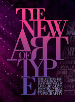
I recently discovered the work of spanish graphic designer Emiliano Lionel Suarez, whose use of typography has really inspired me on this new project. I like the use of the serif fonts as they are not as bold as something like helvetica which is really strong, serifs are softer and look a little more elegant, something i have taken on board for my logo etc, i also like the different sizes and overlapping of the text, as it brings in another dimension


No comments:
Post a Comment