Sunday, 31 October 2010

"For Me Helvetica Is Just This Beautiful, Timeless Thing..."


I've started my research for my essay this week, choosing the "artist that fits into the modernist framework" question, and the artists I wanted to look at in more depth were, WIM CROUWEL and MASSIMO VIGNELLI, who were featured in that modernist period and I have been inspired by their work previously. 
I watched the documentary film HELVETICA, about the typeface of the same name and graphic design as an industry. The film, directed by GARY HUSTWIT, and released in 2007 to coincide with the 50th anniversary of the Swiss typeface, features many highly regarded graphic designers ERIK SPIEKERMANN, NEVILLE BRODY, and NORMAN C.PLACE of BUILD to name but a few. The feature tells the history of the font, how it came about in 1957, designed by MAX MEIDINGER and EDUARD HOFFMANN, how its was seen as a breath of fresh air in the industry, and inspired the modern, Swiss style of graphic design. Helvetica, translated as "the Swiss typeface", was renamed in 1961, from the original name of NEUE NAAS GROTESK to make it more appealing to the Americanised market, and unbeknown to anyone became the most successful typeface of the next 50 years. What I find the most interesting about the film is how the eclectic group of designers argue its credibility in the graphic design world, from Paula Scher, who deemed Helvetica as a "sponsor of the Vietnam war" as well as the "Iraqi war", to the pioneers of the Swiss style in the form of Wim Crouwel and Massimo Vignelli, who adored the the clean, neutral lines of the font. 
"The meaning is in the content of the text, not in the typeface and that is why we loved Helvetica very much" Wim Crouwel


WIM CROUWEL


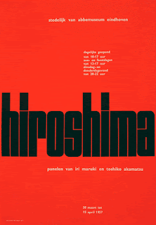
A dutch Graphic designer and typographer, who in 1963 founded the design studio Total Design. In 1964, and onwards, Crouwel designed posters and exhibition catalogues for the Stedelijk Museum, were his work took on a systematic approach, and he started to use grids, "where you can play all your typographic games", and kept all his work within the system, giving a uniformity and structure to the pieces he produced and earning him the nickname "Gridnik".
 As well as the print work, he created a number of typefaces, his most famous being "The New Alphabet", that embraced the modernist format and only used, horizontal and vertical lines and was as wide as it was tall allowing it to fit into every grid system. The font gained a lot of attention and showed up in an number of UK pop magazines and 30 years after designing it was asked to digitise the original typeface. 
Crouwel's work is undoubtedly from the modernist era, his clear cut designs, made his posters and catalogues fresh and new for the 1960's and more important legible, a buzz word for the era, unlike that of the post-modernist artists who say just because something communicates, doesn't make it legible, however in this case the two work hand in hand together, and set the ball rolling for the next 30 years in design. 


MASSIMO VIGNELLI


An Italian Graphic designer, industrial designer and architect, and founder of the design consultancy, Unimark International in 1965, which quickly became one of the biggest design firms in the world. Vignelli Will always be seen as a bearer of Swiss graphic design, often taking his own Italian flair to it, and giving it a graceful, Mediterranean edge and almost single-handily imposed Helvetica into the corporate identity of America. Some of his most recognisable works are for AmericanAirlines and Bloomingdale's. In 1966, he created the identity for the airline and by bonding the two words together to make it just one, showed a fresh way of looking at things and reflected the modernist style making it also one of the only Airlines in the last 40 years to not change its identity. The one-word AmericanAirlines logo, half red and half blue, in plain type, stresses the professionalism, "no gimmicks" attitude of the company in the national colours, and in the words of Vignelli himself "What can be more American than red and blue?"
In 1972 he created the corporate identity for the New York department store, Bloomingdale's, the logo portrays the diversity of the department store. Not one sign, but a collection of three, the first, light for fashions, the second, medium for housewares and finally bold for men's store, is what he created, a typeface design that functions at each level of appropriateness, at set him on his way in being one of the most influential design figures of the 20th century. 


Wednesday, 27 October 2010


Received my brand new Macbook today! Very excited about it as you can imagine. After visiting Vogue on our trip to London, and seeing everyone working on Mac's I decided to invest in one, as when it comes to working in the industry, that's whats everyone will be using, so it gives me a chance now to learn the In's and outs of it and get used to it before going in to the graphic design world. 
I'm also looking into buying the creative suite, that includes photoshop, indesign, illustrator, dreamweaver and premier pro, which once again will allow me to build on my knowledge already and become acquainted with new programmes, like dreamweaver, that i have never used before.


Tuesday, 26 October 2010

WEEK FIVE


So, Ive decided to make even more changes to my shrine, having talked to my tutors, we decide that making hundreds, was a bit unrealistic, and putting to much pressure on myself. so as a compromise, i have decided to build a large box, to house about 70-80 towers, with a small door, were the viewer would have to open it and look into see what was inside, reminiscent of the film of Alice in Wonderland, giving the piece a dream like quality, to the piece which i had, had in mind from the start.
I have also being trying a few new techniques, to try and vary the textures in the piece. For one of the techniques i used emulsion paint to paint across the pages of the towers, giving them a hazy and soft effect to them, once again emulating that dream like quality that i want to get across in my work.


I've been so busy this last week, I've not found the time to even post on here so I'll update with everything that's been going on since i last blogged. here goes...

SCREEN PRINTING
We had the opportunity to try screen printing last week, having never tried it before, i was intrigued to see what the process was all about, having seen some examples of the work, ANDY WARHOL, for example who favoured the technique, I like the outcome, and different variations on the results you can get. Andy Warhol's prints were very precise and lined up perfectly. However, you can also experiment with the screens and alignment, and create a much more soft effect.


Screen printing is a method of print making in which a design is imprinted, on a silk screen or mesh, with areas coated in an impermeable substance, ink is then applied to the screen, forced through mesh on a surface such a fabric or paper, with the image being transferred through. The process is also know as Silkscreen, seriograph and serigraph. Screen printing is about bringing layers into your work, breaking your image down an creating a screen for each layer. Take Andy Warhol's, Marylin Monroe print, the outline would be on one screen the block colours of the skin, hair and facial features, would also be on separate ones each, then when it your comes to printing apply the ink to each screen in turn and running a squeege across the silk pulling the ink through.
here are some other examples of the technique:


Monday, 18 October 2010

WEEK FOUR


After my recent trip to Vogue House in London I decided to look into the magazine itself more and the role of creative director as this is the area of the industry that intrigues me the most, and as part of my research I watched the documentary film "THE SEPTEMBER ISSUE", which gives you a look at the behind the scenes drama that follows editor-in-chief "ANNA WINTOUR" and her staff in the production of the 2007 September issue of American Vogue. The film revolves around the making of the Vogue September 2007 issue. It depicts the effort that goes into making the magazine, and the passion that "GRACE CODDINGTON" (a former model turned creative director and the only person who dares to stand up to Anna Wintour) has for the highly-regarded fashion magazine. The film highlighted to me just how much work goes into creating a magazine, and you see what the issues they face and the dedication that people put into the publication, this isn't just a magazine...

GRACE CODDINGTON
The person who inspired me most from the film, the visionary Creative director, and in my opinion an artistic genius when it comes to directing a photo shoots. Her quirky style, makes her photos the most iconic, she takes risks and dares to be different, something i really admire. Her shoots don't just produce pictures but narratives and convey a meaning across to the audience. She pumps passion and artistry into the pages without being swept up in the world of celebrity that dominates so many magazines these days.

Caroline Trentini

This picture was featured in the 2007 September issue. The shoot was put together at the last minute when Wintour overthrew the previous photos, however in this particular picture, Coddington, insisted that photographer featured was not retouched to make him look thinner. She says you have to be responsible when it comes to retouching, and stated that she didn't want the photographer to look like a model because hes not, hes just an average man and wanted to show the contrast between the model and himself and how highly regarded they are seen to be in the fashion industry, her words ringing out "Not everything in the world is perfect"
here are some of the inspirational works by Grace Coddington:


"When readers pick up Vogue, I want them to smile. Everything should be a little tongue in cheek, a little dare-to-go-there."

©

Sunday, 17 October 2010


So, I've decided to make a few changes to my shrine, I've have now chosen to make the stacks of books different sizes, using larger ones and working down in size to give a ripple effect and sense of perspective. In addition to this, I have decided to make the piece into a "world" of imagination, with buildings, castles, bridges, roads, and a variation of animal and insects. I chose to do this to represent how books can influence a child's imagination and creative thoughts.
22 Books.
4 Butterflies.
1 House.

©

Thursday, 14 October 2010


Started making my shrine today...its gonna be a long one! After deciding my shrine would consist of a space filled with lots of little book towers, all of different sizes, I started making them, out of old pages of books, cutting them down into little squares and placing them on top of each other.
I worked out that i would need roughly around 250-300 to fill a decent sized space! So i have decided to try and use mirrors around the side and on the floor of the room, to give more depth to the piece.
Looks like I'm going to be busy for a while... 8 down, 252 to go :D

©

Tuesday, 12 October 2010

WEEK THREE


looking for inspiration for the second part of the project, DEIFY To create a shrine and treat your object as a god. In the first part of the project i decided created a small 3D piece in the form of a stack of books made from pages of old books, and I have decided to take this idea forward for my shrine and fill a room with stacks of these books.
Artists I am looking to for inspiration are:

Antony Gormley - Field of the British Isles

Kadder Attia - Ghost
 (Saatchi Gallery - Unveiled: New art from the Middle East)

Kadder Attia - Square Dreams

©

Saturday, 9 October 2010


WEDNESDAY 6th OCTOBER 2010
SAATCHI GALLERY
KINGS ROAD -CHELSEA 
The exhibition we saw at the Saatchi was NEWSPEAK:BRITISH ART NOW, with artist including Scott King, Ged Quinn and John Whynne. The stand out piece for me were firstly PINK CHER, by Scott King. A large print on canvas of the iconic Che Guevara picture which had been changed to show the 90's pop star Cher. The piece stood out to me due to the acid pink and contrasting black which grabbed your attention straight away, making the piece look urban and current, but at the same time undermining and mocking the classic Guevara print.
The second piece that stood out for me was by John Whynne, UNTITLED a large installation, consisting of 300 speakers and a piano playing out Franz Léhar’s 1909 operetta Gypsy Love. The piece for me left feelings of unsettlement and eeriness, as the sounds played out thought the space, and as the piano played itself, it conjurged up feelings of nostalgia and loss, as if someone was playing the piano but now isn't, perhaps signifying the death of someone.

THURSDAY 7th OCTOBER 2010
TATE BRITAIN
MILBANK - WESTMINSTER
The main exhibition we saw at the Tate Britain was the TURNER PRIZE, the four contenders for the prize this year were, Dexter Dalwood, The Otolith Group, Angela De La Cruz and Susan Philipsz. The artists work who's stood out the most for me was Dexter Dalwood, who exhibited paintings of events that shaped western culture, with suggestions of imagery from characters from fiction. WHITE FLAG, one of the paintings by Dalwood, shows the ground broken leading towards a white American flag, this could represent the war in Iraq, and how America should pull out, and the broken ground showing how their society is suffering. A second work, GREENHAM COMMON suggests something trapped, trying to break out, and black and orange colours contrast the background of the painting, and could represent anger.
Angela De La Cruz's work however didn't have the same effect on me as the previous, her works of painted canvases twisted and contorted left me feeling confused, and as we stood around the exhibition you could see the magical act taking place as the authority of the paintings being shown in the gallery commanded people to see them as something of prestigee.


While we were in the Tate Britain we also saw a small exhibition of some of the work of DAMIEN HIRST. His work is often seen as post modern and quite controversial and the exhibition we saw proved this be very much the case, especially the piece WITH DEAD HEAD, were we see a young Damien Hurst, who had gone into a morgue and taken a photo with head of a dead man. The piece leads to something quite sadistic and and disturbing in the fact he is laughing while carrying out the act. In the exhibition you see that he has some what of a fascination with death from "AWAY FROM FLOCK" a sheep preserved in formaldehyde, representing leaving the safety of the church and a reference to religious decay, to "MONUMENT TO THE LIVING AND THE DEAD" a large painting consisting of two equal sized squared canvases one black, one white on which exotic butterflies are embedded, the black and the white signifying Life and Death.
"I think I’ve got an obsession with death, but I think it’s like a celebration of life rather than something morbid. You can’t have one without the other."
(Damien Hirst and Gordon Burn, On the Way to Work, London 2001)

VOGUE
VOGUE HOUSE -CONDE NAST- HANOVER SQUARE
We then went on to Vogue House, to take a tour around the Vogue Office and to meet the creative director ROBIN DERRICK. We where firstly taken up to the art department on the 5th floor, to see the December issue being put together, ready for print that night, we were also told at the time they were in the first weeks of developing the January issue.
Emma Watson appeared on the front cover of the December issue, with a stunning typeface by Joe Ratcliff adorning the over also as well as inside. World renowned photographer DAVID BAILEY also featured in the issue shooting some of the world most famous models for a spread inside the magazine.
British Vogue is seen to be more commercially minded than that of say  French Vogue, who can afford to be more out there. This is due to the amount of advertising the magazine relies on, trading space with the worlds most famous designers who all want that lucrative spot in their magazine. More money is made from advertising than it is from sales of the magazine itself. Also is recent years, celebrities have become the way forward to sell magazines, readers see a certain celebrity wearing the garments there for aspire to own them too. It was different in the 80's were the models sold the magazine or the 60's were it was the photographers that sold copies.
Following this we made our way to the archives in the basement, in previous years past publications were sent down to the archive in print format, in the form of original photos, proofs and the magazines itself, but over recent years, they have started to be transferred in the form of a DVD, and will very soon be sent digitally with no tangible object passing hands.
After we have toured the archives we were able to look through 80 years worth of Vogue, and other magazines such as GQ. There was a clear contrast between Vogue of the 20's with its hand drawn pictures all in black and white to the 2010's crisp, clean cut layout and precise photography. We also discovered that retouching was not a product of recent years, and that even old prints had been retouched by hand, showing us that even then there was no real representation of beauty.
Finally, we got the chance to meet ROBIN DERRICK, creative director who took 10 minutes out of his hectic schedule to take to us about Vogue , his job and giving us great advise on the industry:
"You probably already know the company you will work for", and prompting us to e-mail and send letters out along with a portfolio to get your name recognised. In addition to this probably the most important thing he said was that
"Print in the next 2 years will be dead."
Everything will be produced digitally, and its already happening, this month Robin Derrick had been working on a digital version of Vogue, for the i-Pad that was to go live in the next few months and in addition to that a previous Salford graduate hand been given the chance to create an app for the i-phone that had been so well received in the industry, he had been offered a job at Conde Nast and was working along side some of the worlds top designers.

©

Monday, 4 October 2010

WEEK TWO


1. Work in to photgraphs using gouache ü
also used fine liner and bleach
2. Create a sound recording, of my mum reading a section of the book ü
3. Create a cutout, revealing something underneate ü
4. Explore patchwork, by sewing paper, fabric and photographs together.
5.Combine different books, showing how things can intertwine and lead to new things
plan to finish the other things tomorrow, before we head off to London to Vouge HQ to see the archives!

©

Sunday, 3 October 2010

WEEK ONE


chosen object. childhood book - Paddington Bear,
11 of the 25 representations of my chosen object completed.

Collage.
I used this technique as i felt it represented how books can lead to, and uncover new things how they can open doors to new worlds and encourage the imagination of a child.
Watercolour.
I chose to use watercolour as the washed out results are reminiscent of that seem in children's books, especially the one i have chosen, Paddington Bear. They also provide a dream like quality to the work.
Photography.
I have used photography as it captures as certain moment in time, often a cherished one and this relates to my object a great deal, for example the cherished moments I shared as a child with my mum, when she read to me.

focusing on things such as Typography, regarding the meaning of the object to me, firstly in the form of a poem which i wrote myself, expressing the importance of family tradition and feeling safe and secure. Then secondly in the form of a small book, highlighting certain words that i relate to the object.

Whats Next.
1. Work in to photographs using gouache.
2. Create a sound recording, of my mum reading a section of the book.
3. Create a cutout, revealing something underneath.
4. Explore patchwork, by sewing paper, fabric and photographs together.
5.Combine different books, showing how things can intertwine and lead to new things.

©