Thursday 24 February 2011

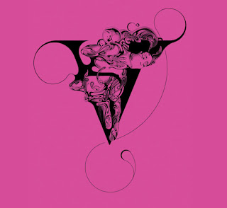
We had a crit today, just to see were everyone was up to with their projects and so we could get feedback from our tutors aswell as any ideas from the others in the group. It is one of things that I find myself struggling with, having to talk about my work, as i get a bit nervous, but these crit’s help alot in building my confidence in talking about the work. Anyways, had a very productive day today! Heres some of the Si Scott influenced typography that i have been doing over the past few day. I think they work really well, and Im defiantly going to be developing these further for posters etc.
Very excited for the Si Scott lecture tomorrow!!


Been trying out some poster designs today, using the photocopy images of the flowers that i had done previously. I wanted to try and use these in something as i thought they worked really well, so developed them as poster. All though they weren’t really what i was thinking for a poster, i initially just wanted to use typography, I think these are really successful. They look modern and fresh, which is what i wanted to convey through the posters, also i think the colours are really soft and beautiful. Quite successful methinks!


Tuesday 22 February 2011


Stina Persson  
Just came across her work and its so beautiful, i love her use of colour and range of mark making, its delicate yet still conveys a strong image.


Nadia Flower
I love how fragile and delicate, these pieces are, quite fantasy like, and the typography is stunning! Inspiration much!


Amazing Illustration Website Archive!


So since were off to salford on Friday afternoon , for a little talk by Graphic designer Si Scott, i thought id check out some of his work before hand, and what i found was amazing! His work is so delicate and pretty, and i love the use of typography through out his work, and it gives the impression of a story being told as it flows really well. Defiantly will be having a little try at some hand rendered type like this and try a bit of colour too, wether they will look as amazing as this i don't know!! Roll on friday!


Friday 18 February 2011


Exit Through The Gift Shop is a film directed by Banksy that tells the story of Thierry Guetta, a French immigrant in Los Angeles, and his obsession with street art. The film shows Guetta's constant documenting of his every waking moment on film, from a chance encounter with his cousin, the artist Space Invader, to his introduction to a host of street artists with a focus on Shepard Fairey and of course Banksy, whose anonymity is preserved by obscuring his face and altering his voice, to Guetta's eventual fame as a street artist himself. I don’t often like the work of street artists, 
However i do admire the work of Banksy, whose public art shows his contempt for the government labelling street art as Vandalism. His clever use of stencils gives his work and intricate detail without being to complicated or time consuming and resulting in stunning imagery. From printing a 1 million pounds worth of fake £10 notes to his stencil art seen on the streets of London he is an inspiration to many artists today and for many years to come.


Another Artists whose work stood out to me in the film was that of American Graffiti artist and Graphic Designer, Shepard Fairey. First becoming know from his OBEY sticker campaign, which he describes himself as an experiment in Phenomenology, a process of “letting things manifest themselves” causing people to question of the sticker itself and the relationship with it surroundings, something i find quite fascinating. He is also very well know for his campaign posters for Barack Obama. 


Finally the main artist that is featured in this movie, isn’t really an artist at all well not at first. Intrigued by the work of street artists he began to document how they went about their work, and the dangers they faced when carrying it out. First filming his cousin Space Invader, then Shepard Fairey and eventually Banksy, who essentially kick started his career in the graffiti world when we told him he should create some of his own work and put on a small show.


 However his Exhibition was not so small, brought to the attention of the art world by LA weekly, 7000 people attended on the opening night alone. He shows how easy it is to make art and that anybody can do it,  even his alias Mr Brainwash dictates that he is brainwashing everyone into thinking that he is an artists when he really isn’t. 
Some people could see this to b showing the art world in a bad light,  as Banksy says himself;
"I used to encourage everyone I knew to make art; I don't do that so much anymore"


Just thought that i would upload a few of my sketch book pages, showing colour scheme ideas and logos etc. After looking at few different schemes i’ve settle on a blue and grey scheme, I wanted the website to have a modern feel to it, and i feel that with this scheme, it is clean, clinical and professional, yet has a modern and fun edge to it. 


final logo design
screen shot of one of the pages of my website. 


Saturday 12 February 2011


have been trying some new and creative ways of doing observational studies of flowers. I had the idea of  scanning the flowers, just to see what they would come out like having never done it before, and i was pleasantly surprised by the results. They came out very delicate and soft, but with an erie mystery around  them, i think they worked rather well. I’ve also got some flowers in the freezer at the moment so i’ll let you know how that goes!


The task we were given today was to create a poster design that was the opposite of what we would have expected from the brief. For mine i decided to create something that looked really old fashioned and that would maybe appeal to the older generation, the opposite to what i want to create in my competition were i want it to be fun, fresh and young.

Thursday 10 February 2011


I was lacking inspiration today, so had i bit of a tutorial with my tutor, who gave me a few ideas for photography etc. I started to realise that my work was lacking in anything different, and had been done before, but couldn’t seem to get out of that style so, Dave, showed me the work of Nadav Kander.


whose campaign for the National Ballet, shows how something as beautiful as a Ballet dancer can change the surrounding they are shot in. and make the mundane seem, equally as striking. I have tried to re-create this in my own photos, by Photographing the flowers on distressed backgrounds, however i dont feel as if they have worked out as well i have hoped, they look a little scruffy, thrown together and i’m just not happy with them, I  think i may have to go back to the drawing board.....

Tuesday 8 February 2011


Just thought i’d share some of the collages i’d done today, i think they are quite successful to be honest. 


We had a lecture today on how sound and how it can help sympathy and emotions towards certain things, this was to help us with our current essay on Persepolis and how we can relate what we saw to the film in question. 
The first piece we watched was Disclaimer, by Michael Curran, A thought-provoking and disturbing work which questions the motivations recording another person's image on video. As the performer is made to carry her speech, repeatedly saying
 "The characters and events portrayed in this videotape are entirely fictional. Any resemblance to persons known either living or dead is purely coincidental" she becomes increasingly distressed. The viewer is left wondering what happens when the camera is switched off. Its gotta be said that i did find the clip disturbing as you see her get continuously upset, but i do think what curran has produced is vey clever. It challenges the truthfulness behind film, and how nothing is ever what it seems, here is always some sort of construction involved.

Still from the video installation Disclaimer.

The second piece we saw was Reveal, by Dryden Goodwin, the short video focuses on the evolution of a portrait made on a piece of paper videoed from a small camera above. The soundtrack plays back the developing conversations and interactions Goodwin had with strangers whom he approached  The video discloses the decision process of marks for each drawing as well as the exchange between 'sitter' and 'artist’. I found this piece amazing, to be honest. The fact that at the start all you hear is the mans voice, and you automatically picture a person in your head, and then as he begins to draw, you see that in fact he is nothing like you would imagine. You also get an insight into the mans life, the sound is enough to give you an emotional and sympathetic feeling towards his life. 

Still from the video installation Reveal