Tuesday 14 December 2010

Having a very productive day today, started to make my website tonight, after playing around with dreamweaver for a couple of days, after buying CS5, and i’m now feeling more confident with it. I used one of the liquid templates, and edited the colours, to white, blue and grey, giving a clean and precise image of the company. 
I created the logo and menu bar in photoshop and added links in to other pages. I have started on the second page, detailing what the company is about. I have edited the layout on this page getting ride of the side bars, and changing the colours. overall i’m quite pleased with the way website is coming along, considering I had never used Dreamweaver a few weeks ago!


Just a quick little post to show some of my logo designs for the masthead that I’ve just created. 


Been working most of the day in my sketch book, putting down ideas on layout and colour schemes, and annotating the Mock up i had done previously, so i thought i’d upload a few pages, along with some experimental collages I’ve done previously and some typography. 
enjoy <3


Monday 13 December 2010

WEEK TWELVE


I Decided to make a mock up for my magazine, using some photos i found on the internet, just so i could get an idea of how the final outcome will look. I intend now to plan out a grid using indesign of the construction of the magazine, which will help will the layout of the content etc. 


Wednesday 8 December 2010

WEEL ELEVEN


We started the research for our new essay today, were we have to write a critical review for the film Persepolis, written and directed by Marjane Satrapi and Vincent Paronnaud, an autobiographical account of the life of Marjane Satrapi. Persepolis is a weight film, depicting the struggle of a woman living in Iran, the collapse of a government and the iranian revolution. Even though the film is shown as an animation, we start to get drawn in and beileve that it an actual representation of what is happening, instead a series of drawing. In addition to this the film uses, cinematic techniques that would be seen in none animated movies such as film noir, for example panning shots and monologues. Also a very clever technique used in movie to make you belive that it is real, is when we are shown a puppet show, which therefore makes us believe that what we are watching is real and the puppet show not. Overall i found the film very moving, with the struggle of Marjane Satrapi being a harrowing series of events, shown in a unique and sensitive way. 
Im starting the essay by writing 500 on how gender is represented in Persepolis in the next few days and then progress from there by focusing on different issues dealt with in the film, before combining them for the finished essay, i think this will help me manage my time better when writing the essay. 


Friday 3 December 2010

WEEK TEN


Handed my essay in this week, and I’m quite pleased with it actually. I eventually decided to do my essay on Wim crouwel, as i am very much inspired by his work and ethos. Although i’m quite pleased with my essay, i have learnt that i have to manage my time better when it comes to writing it, and start researching earlier instead of putting it off, or focusing my attention on the other things that we have to do. 
For the narrative project, i have chosen Tito stay with Salford, and focus the magazine of the arts. I went today to take some pictures of a few places, but because of the bad weather it was hard to get places! (including trains being cancelled!), I have chosen to look at Islington Mill for the historical part of the piece, and look into the restoration of the building and the events that they have there. For the contemporary part, The hub and the connection with Salford Uni, however i am struggling with the personal experience part, but i do intend to go to islington mill in a few weeks so i think i will use that. For the magazine itself i intend to use an experimental layout, like those we made at the book binding workshop, and I'm going to tryout a few layout tomorrow and see which will be the most successful. 
Finally for the website i am sticking wit the Clear View UK brief however i have been neglecting this part slightly having only done a few drawings for logos etc, but I'm getting the creative suite next week so i’ll be able to get cracking with creating the website. 


Friday 26 November 2010


we went to a book making workshop at salford this morning, which at first i thought wouldn’t be so helpful, but actually found it really insightful and quite fun. We started of by learning about the grain of paper, and how printing against the grain can affect the book, we also learnt about weights of paper for example 40 gsm paper, would be thin photocopy paper, were as a higher gsm of 150 would be thick quality paper.
We started off by making a “beak” book, requiring you to fold a piece of landscape paper in half and then half again, then turning it back to portrait and folding it in half. Unfold the paper, and fold it in half landscape ways and cut it to halfway, so when you open it out you get a “beak” effect. In addition to this we tried making “Trouser” books and concertina books. 
We also got to look through some artist examples using the techniques we had just learnt. i found this part extremely helpful, with our current brief, were i felt that i had to be very precise with the book/magazine that i made, so it had a Swiss graphic design feel to it, however, after looking through some examples, i realise i could be more free and creative with what i made, so i intend to experiment with different structures and shapes over the weekend to see what kind of interesting results that i can create. 

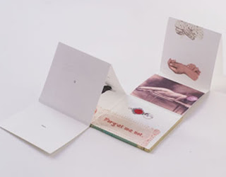
Books made by the Artist who lead the workshop. 
Lucy May Schofield.


Wednesday 24 November 2010

WEEK NINE


I entered a competition a couple of months back to design a logo for Big Brother winner Josie Gibson’s new clothing range “Randymare”, i didn't think anything would come of it but got an e-mail today saying that I had won!!!! I can’t believe it!!!! The hoodies are on sale now and are all sold out.
They said they will be in contact with me with dates for lunch with Josie Gibson and they are sending me free hoodies as well!
Well you have to start somewhere don't you!


Wednesday 17 November 2010


We got our new brief today, so excited as it’s an editorial project, we are are rrequired to design a series of page layouts for a publication concerned with the district of Salford (however we are able to chose a different one if we like), its history, people, and future, for the City council. We have to chose one of 3 themes to base our content on, either Music, Art or Architecture. I have decided to stick with Salford/Manchester as I love the city itself, and as we have to share our own personal experiences, i feel i can draw on them more with somewhere I love. Having done some quick research today I’ve decided to focus on the Art scene in Manchester, there are so many well know galleries such as the Whitworth, Lowry, Cornorhouse and Manchester Art Gallery along with a few less well know ones for example, Islington Mill an independent gallery and creative hub allowing artists to rent studio space. 

Islington Mill
So excited to get started on this project now, as it completely different to the previous one and will throw up new challenges and require different skills, as we will be working alot in Indesign, which i have used a lot in previous projects, and feel quite confident in using it however we did have a refresher tutorial yesterday, on the ins and outs of the program, learning the basic of setting paragraph styles, using placeholder text and basic layout properties. I’ve got a long way to go but i think i will really enjoy this project.


Tuesday 16 November 2010

WEEK EIGHT


So I have been looking into our on going professional context project, where we have to create a website, for a company/. There were 4 companies to choose from: 
California Custom Cycles - An American Custom bike company coming to the UK
Philipa’s Patch - A wine bar
Silent Chaos - A Manchester based band 
Clear View UK - A high street brand of opticians 
Out of the four the one that appealed to me the most was Clear View Opticians, as i felt looking at a few websites for opticians and going through a few ideas i felt i could have the most fun with this brief, also as i wear glasses my self, i felt i had more knowledge of this than the other 3. 
The brief has asked for a website to be made, alongside a company logo, and an embedded motion piece. In addition to this a downloadable PDF brochure with a 15% off voucher, and i have been researching a few opticians websites and brands of glasses, and was greatly inspired by the Ray Ban website. The website caught my attention straight away, with the bright colours and funky illustration, which sends out a very modern and contemporary image, exactly what they are trying to get across to the audience, reminding me very much of the work of Push Pin Studios.


I also had an idea for a motion piece for the website, I’ve seen this ad many times on TV 
Look Fashion magazine ad
I know the ad has nothing at all to do with opticians, but what i liked the most is how it used images and flicked through them, and the idea i had for my motion piece was to take photographs of different people, wearing all kinds of different frames, and have them flash up one after another like the Look Magazine ad, with a strap line of something like “frames to suit everyone” and then at the end have someone with no glasses saying “or not...” to advertise the fact that they provide Laser correction surgery, this is just a few quick thoughts that i had on what i could produce for this project, and as it is an on going project in gives me plenty of time to experiment with different ideas.

Monday 15 November 2010


Have been working hard on my essay this past week, especially this weekend having handed in my project  i was able to focus on it more than i had been doing previously. I decided at first i would focus my essay on Massimo Vignelli, however after researching into more modernist designers, i decided to go with Wim Crouwel. To me his work and the way he produces it is so inspiring, For his clean and precise posters for museums, to his grid systems and technical type make him, one of the pioneers of Swiss Style. 


Saturday 13 November 2010


So the project is finally over, and i handed everything in yesterday. I've really enjoyed this brief and found it challenging and it has allowed me to explore new ideas. One of the most refreshing things about the project was that we had to think so conceptually about the pieces, especially the Deify section, which brought in a fresh was of seeing and doing things. 
However, I have to say the most enjoyable part for me was the final Glorify part. One of the things I enjoy most about graphic design is producing print pieces so when we had the chance to promote our shrines, I feel that I excelled at this part the most, however I did find the other two briefs exciting, challenging and equally enjoyable, especially the very first project, Objectify, where we had to create 25 representations, this challenged our creativity and made us think and explore new techniques. 
Overall I found this brief very enjoyable, and look forward to starting our next project in the coming weeks.


Tuesday 9 November 2010

WEEK SEVEN


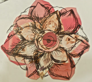
I started the final piece of the project this week, to publicise the Exhibition that will be taking place to show are shrines, in a few weeks time. As you can see above i have started off with a design for a poster, the first picture is of my initial design idea, wanting to utilise that handmade look that i love so much, i initially wanted to sketch the whole piece, incorporating the hand drawn typography to give it that vintage feel, The second picture is the realisation of my idea using Photoshop. I have Incorporated, found images and my own images of flowers for the surrounding wreath, in the centre my own photo, from my 25 representations with hand drawn type that i scanned in and overlayed, and accompanied with some, art deco inspired digital type. Now the piece is finished, I am very pleased with the outcome, it conveys exactly what i wanted for the exhibition posters, and hopefully carry through to the other piece i plan to create, including one additional poster, and invitations/ postcards, each with a different design. 

Some Other Ideas...


Thursday 4 November 2010

WEEK SIX


Started the final part of the project this week, to advertise an exhibition of our shrines, in the form of posters, postcards, exhibition guides etc. I started off looking through books for inspiration for my project, and came across a book on STEFAN SAGMEISTER - Things I have Learned in my Life so Far, and was greatly inspired by the typography, and lecture posters that were presented in the book. The hand rendered type that he uses in most of his pieces was what i liked most, and wanted to take an element of that an transfer it to my own pieces. his style is striking to the point of sensationalism with a hint of humour, that in some ways makes it unsettling way, but not quite unacceptable. The beauty of his work is his ability to conceptualise and create original and stunningly appropriate ideas. 


also while researching i came across IDN Magazine - The cut and paste issue, featuring digital and paper collage. having explored this style of work before, i wanted to go back to it again, the hand made feel of the collages, was something that really appealed to me, giving it a vintage and dreamlike quality to the pieces. Collage is often dismissed by some as a hobby or a craft activity for kids, yet it has an effective way of communicating. EDUARDO RECIFE, is also an artist who uses collages in alot of his work, using a mixture of photography and illustration, in combination with handmade type to create the stunningly beautiful collages.